Just buy a brewery

February 03, 2026
by a searcher from Dartmouth College - Tuck School of Business at Dartmouth in Cary, NC, USA
Introduction
“Valuation is more art than science. The exact intrinsic value of any business is unknowable.” (Warren Buffet)
Investing is first and foremost an art, not a science (Seth Klarman)
Yeah… but what if it were?
For this analysis, I referred to two sources:
(1) SBA 7(a) Performance by Top 100 NAICS industries (Lenders Cooperative)
This report provides a comprehensive analysis of SBA 7(a) loan performance across the top 100 industries by dollar amount of SBA 7(a) loans approved in the past three years, sorted by annual charge-off rates. Industries are classified by the North American Industry Classification System (NAICS).
(2) Bizbuysell Data tables
Because, well, they actually give you multiples.
Now, I checked with all my favorite LLMs and they all said that nobody had done what seems trivial
COMPARE THE TWO DATA-SETS WITH EACH OTHER
You see, the Lenders Cooperative piece, provides you with 6 different, significant (large samples) data points about the success of SBA loans per 100 industries.
Now, it’s not that I don't have the raw data - I do, but my personal 80/20 rule favors this short-cut.
Also, there is no equivalent ROIC data. I don’t know what LPs make per industry. There is a little information on broad categories by Cambridge Associates, and on public companies by Damodaran (who else), but neither are even close to being good enough for us.
Of course, if you’re a data aggregator, and you’re reading this, and you want to provide me with NAICS specific, large sample size data, I would be in your debt forever. Can’t guarantee not defaulting though.
------------------------------------------------
Data:
These 6 are as following:
Annual Prepayment Rate
This shows how often borrowers pay off their loans early in a typical year. A higher rate means loans tend to end sooner than expected, often due to refinancing, business sales, or faster growth.
Lifetime Prepayment Rate
This measures how many loans were paid off early at any point over their full life. It tells lenders whether early payoff is a one-off behavior or a consistent pattern in an industry.
Annual Default Rate
This reflects how frequently borrowers fall into serious trouble in a given year, such as missing payments or filing for bankruptcy. It is a good indicator of short-term or cyclical stress.
Lifetime Default Rate
This shows how many loans eventually default over time, including during recessions and downturns. It captures long-term, structural risk rather than year-to-year volatility.
Annual Charge-Off Rate
This represents how much loan money is actually written off as a loss in a typical year. It focuses on real dollars lost, not just borrowers missing payments.
Lifetime Charge-Off Rate
This is the ultimate loss metric. It shows how much of every dollar lent to an industry was never recovered over decades of lending history.
Points 3-6 show risk, points 1-2 show upside, and together, they are a great indicator to the return on investment for small businesses by industry. Without having a True, real ROI / IRR number by LPs (again, I’ll be in your debt forever), this is probably the next best, if not better in many ways, indicator.
Bizbuysell data, conversely tells us the cost, or the average valuation multiple for each of these industries. There are some mismatches, and I had to vlookup, and fuzzy vlookup and even remove a misaligned bunch. But ultimately, I was left with a decent and clean database of 66 industries, appearing on both datasets - risk vs. cost. What can be simpler than that?
------------------------------------------------
Quick notes on Methodology:
Each of the 7 elements was standardized, as a factor of the average of the specific element (e.g. if average valuation is 4x, and for a specific industry it’s 6x, the standardized number is 1.5x)
Each of the 7 elements was then ranked from best to worst. This means that on Prepayments, the rank was (x1,x1:x66,0) so the industry with the best prepayments is first, whereas defaults were ranked as (x1,x1:x66,1) due to its inverse nature.
Average deal size was correlated positively (R=.55, R2=.3) with valuation. Therefore I isolated this size effect by regressing valuation multiple against deal size (using a log-quadratic specification) and analyzing residuals. These represented size-adjusted multiples, showing which industries trade above or below what their deal size alone would predict. Thus allowing us to examine the relationship we were looking for (debt performance and valuations) without the confounding influence of size.
While I did create a risk only number (i.e.; factors 3-6 in Lenders Cooperation data), I decided to use an all inclusive number to compare with the valuation. This was done by assigning 6 weights(∑=1) to these 6 factors and then choosing the weights that maximized the correlation with cashflow multiple. Admittedly that wasn’t much (.19! And I will touch upon that number later), but it’s something. So ultimately, these two numbers (the all inclusive risk and reward SBA number and the Bizbuysell valuation number) were compared to each other
The delta between these two ranks (simply put: valuation rank MINUS weighted risk-reward loan factor rank) determined the outliers, and there are many.
As for sample sizes, it’s fair to say that while the Lenders Cooperative numbers all had very large sample sizes (100s or even 000s for the most part), this was not the case with Bizbuysell data. Common practice is to use N>30, however, I decided to use N>18, mostly because I wanted to fit the title of this article, and I couldn’t otherwise. Sue me.
------------------------------------------------
Results:
Here are you top and bottom 10s
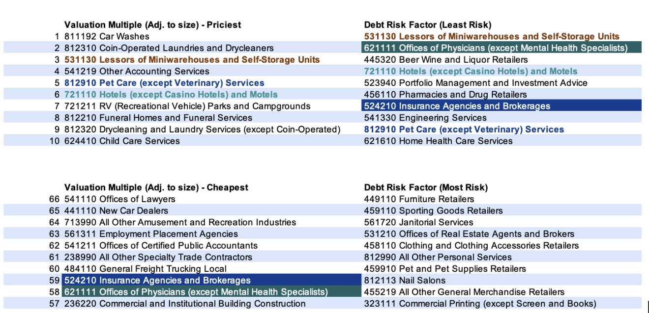 Color coding is only for the purpose of matchmaking. As you can probably guess, I am not a designer, nor a match-maker
So, on the top left, we have the top 10 priciest valuations (adjusted to size as explained above, which is why the raw number doesn’t matter, but suffice to say, they are all at the ~4x range)
On the bottom left, we have the cheapest of all (ranging between 1.5x to 2.9x multiples at Bizbuysell), again - adjusted to size.
On the top right, we have the industries with the least risk (average Prepayment for these = ~30%, average defaults at ~7% and average loss (annual) at .5% and average loss (life) at 2.4%
And on the bottom right, you have the riskiest of them all. (Prepayments Annual ` 9%, prepayments life 40% (!), defaults annual 3.8%, defaults life ~20%, losses annual 5.3% and losses life at ~13.9%
The color coding is already revealing the two best industries (not breweries, not yet) - offices of physicians and insurance agencies are cheap, they have very little risk, and they represent everything that’s wrong with America
also color coded industries like Pet Care, Lessors of miniwarehouses and non-casino hotels and motels, but having them on the “good quadrants" of both sides in the equation also means they don’t have that much arbitrage - they are not risky, and they are priced accordingly.
Remember that .19 correlation (R2=.04 , or very very close to 0) - yep, that means that however people do price industries, has nothing to do with default rate - everything is wrong, nothing is explained and unless I am very mistaken that means arbitrage and then some.
And this all leads us to answer the question - which industries are worst to buy (expensive, very risky) vs. those that are best to buy (cheap, little risk):
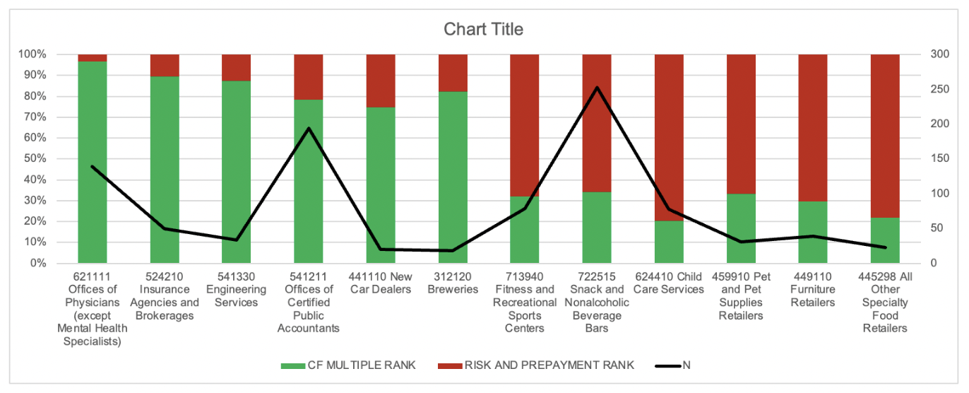 I chose 6 on both sides (and also displayed N, because statistics are important). More green is more good, more red is more bad. And as established doctors and insurance agents might occasionally fail in morals, but at least they succeed in life, as long as life is measured by $$$. Conversely, If you’re at retail… just don’t do retail.
(For you nitpickers, this is by order, even if it doesn’t look like it. They are ranked by delta, not by %).
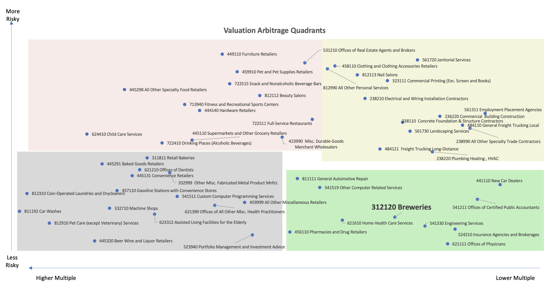
And just in case you’re interested in the entire scatter - this is what it looks like. Pinkish red is bad, Greenish is good, Grey is solid (high multiple, low risk), and yellow (low multiple, high risk) is the in-between
 ------------------------------------------------
Caveats and Conclusions
a. First and foremost, this is highly academic, or worse yet - pop-academic.
b. No industry data can tell you anything about a specific deal. In due diligence, you model the deal, not some BS written by a random dude on Searchfunder (=me)
c. Bizbuysell data, seen here as the holy grail of half of the equation, deals mostly with low cap stuff (the 66 industry average for each median of these 66 industries in the database is $550k). This has no bearing on industries when you start getting to the >$5M price range.
d. I confess, I have no idea how people actually decide to evaluate something vs. the other. I do have a major in psychology, but from Thaler to Kahneman to this slightly less famous Deloitte consultant and others, much can be inferred about numbers being no more than perception. Probably unless you’re a casino, and maybe even then.
5. Other valuation factors that were not discussed in this incredibly narrow paper are plentiful and include:
-Industry growth rates
-Profitability/margins
-Market trends/sentiment
-Competitive dynamics
-Scalability
-Regulatory environment
-Exit opportunities
-Biases, many biases
-Other
-More other
But whatever you do, why not live your life-long-dream, go out there, and get yourself a brewery.
 Color coding is only for the purpose of matchmaking. As you can probably guess, I am not a designer, nor a match-maker
So, on the top left, we have the top 10 priciest valuations (adjusted to size as explained above, which is why the raw number doesn’t matter, but suffice to say, they are all at the ~4x range)
On the bottom left, we have the cheapest of all (ranging between 1.5x to 2.9x multiples at Bizbuysell), again - adjusted to size.
On the top right, we have the industries with the least risk (average Prepayment for these = ~30%, average defaults at ~7% and average loss (annual) at .5% and average loss (life) at 2.4%
And on the bottom right, you have the riskiest of them all. (Prepayments Annual ` 9%, prepayments life 40% (!), defaults annual 3.8%, defaults life ~20%, losses annual 5.3% and losses life at ~13.9%
The color coding is already revealing the two best industries (not breweries, not yet) - offices of physicians and insurance agencies are cheap, they have very little risk, and they represent everything that’s wrong with America
also color coded industries like Pet Care, Lessors of miniwarehouses and non-casino hotels and motels, but having them on the “good quadrants" of both sides in the equation also means they don’t have that much arbitrage - they are not risky, and they are priced accordingly.
Remember that .19 correlation (R2=.04 , or very very close to 0) - yep, that means that however people do price industries, has nothing to do with default rate - everything is wrong, nothing is explained and unless I am very mistaken that means arbitrage and then some.
And this all leads us to answer the question - which industries are worst to buy (expensive, very risky) vs. those that are best to buy (cheap, little risk):
 I chose 6 on both sides (and also displayed N, because statistics are important). More green is more good, more red is more bad. And as established doctors and insurance agents might occasionally fail in morals, but at least they succeed in life, as long as life is measured by $$$. Conversely, If you’re at retail… just don’t do retail.
(For you nitpickers, this is by order, even if it doesn’t look like it. They are ranked by delta, not by %).
And just in case you’re interested in the entire scatter - this is what it looks like. Pinkish red is bad, Greenish is good, Grey is solid (high multiple, low risk), and yellow (low multiple, high risk) is the in-between
 ------------------------------------------------
Caveats and Conclusions
a. First and foremost, this is highly academic, or worse yet - pop-academic.
b. No industry data can tell you anything about a specific deal. In due diligence, you model the deal, not some BS written by a random dude on Searchfunder (=me)
c. Bizbuysell data, seen here as the holy grail of half of the equation, deals mostly with low cap stuff (the 66 industry average for each median of these 66 industries in the database is $550k). This has no bearing on industries when you start getting to the >$5M price range.
d. I confess, I have no idea how people actually decide to evaluate something vs. the other. I do have a major in psychology, but from Thaler to Kahneman to this slightly less famous Deloitte consultant and others, much can be inferred about numbers being no more than perception. Probably unless you’re a casino, and maybe even then.
5. Other valuation factors that were not discussed in this incredibly narrow paper are plentiful and include:
-Industry growth rates
-Profitability/margins
-Market trends/sentiment
-Competitive dynamics
-Scalability
-Regulatory environment
-Exit opportunities
-Biases, many biases
-Other
-More other
But whatever you do, why not live your life-long-dream, go out there, and get yourself a brewery.
from University of Virginia in Charlottesville, VA, USA
from University of Virginia in VA-20, Charlottesville, VA, USA